
Case study: Cookeep
Lifestyle/ Visual Design/ UX
An app that allows bakers/cooks to keep, retrieve and update recipes in the easiest way.

ABC Bakery is a nationally well-known bakery based in a metropolitan city - Ho Chi Minh, Vietnam. ABC strikes to deliver the most consistent quality pastry across Vietnam. Since the CEO of ABC wants to expand the business to other regions of Vietnam, they want to have an app to keep and update recipes across all kitchen staff.
DATE
October 2021 - January 2022
ROLE
UX designer designing an app for ABC Bakery from conception to delivery
RESPONSIBILITIES
Conducting competitive audit, conducting interviews, paper and digital wireframing, low and high-fidelity prototyping, conducting usability studies, accounting for accessibility, and iterating on designs
Design Thinking Process

[ THE CHALLENGE ]
How can amateur/home-based/professional bakers usually store and update hundreds of their recipes in the most convenient ways?
[ THE SOLUTION ]
Design an app that allows bakers/cooks to keep, retrieve and update recipes in the easiest way.
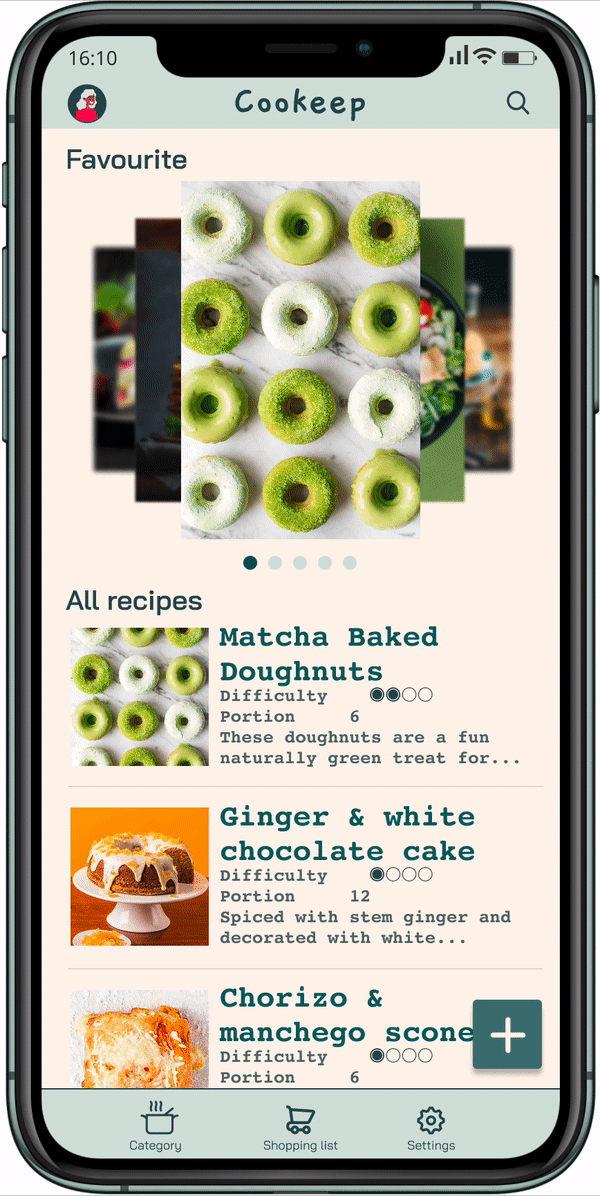
Home Screen
I introduced the homepage in order to provide a central place for a user to go from when starting recording a new recipe by the CTA button on the bottom right corner or browsing their available recipes.
Users have the option to Add New Recipes or access their All Recipes.
There is also a carousel of images that shows their favourite recipes.
Add New Recipe
There were 3 methods of adding new recipes (manual, from websites, and photos) to explain the carousel design, but I decided to focus on the manual method as it is the most common way.
From home screen, users can click on the + icon to add new recipes. The app also has suggestions for names of ingredients so that users can save time.
Some participants in the usability study have said they do not want to type out all ingredients. By providing suggestions, I have mitigate their concerns.


Search Recipes
Bakers/cooks can search for their recipes right from the homepage.
The app also offers some suggestions so that users can save time in typing. Before the first usability testing, there was no search function, and some participants of the usability study have shown their concern if they have hundreds of recipes in the app.

Browse Recipes
Users can browse recipes by tapping and swiping gestures.
I design the Ingredients and Instructions tab to be slightly see-through so users can easily be reminded which recipes they are reading.


Settings
The app is also available on desktops so that users can opt for syncing across all devices.
In the future, there will be updates with dark theme colour to accommodate users with light sensitivity.
As a Vietnamese, I design this app also to help Vietnamese bakers/cooks who are not fluent in English to store their precious cooking recipes. Therefore, this app is also available in Vietnamese very soon.

[ FOUNDATION RESEARCH ]
Foundational research is always done before I start designing. Within the product development life cycle, foundational research happens during the brainstorm stage (stage one) to help me empathize with users, understand their needs, and inspire new design directions.
In foundational research, my goal is to figure out what the user needs and how to address those needs with my product.
Questions I want to answer during foundational research include:
What should we build?
What are the user’s problems?
How can we solve those problems?
Am I aware of my own biases, and am I able to filter them as I do research?
Competitive Analysis
As part of my Competitor Analysis, I conducted an analysis on 4 apps with similar product offerings to Cookeep. Three of them are direct competitors (Recipe Keeper, BigOven, and Kitchen Stories) while Cookpad is an indirect competitor.

User Research
Summary
Pain points
Personas
User journey maps
Research synthesis
Summary
I conducted both qualitative and quantitative research to understand the users I’m designing for their need. A primary user group identified through research was amateur, home-based, and professional bakers/cooks.
I am looking to create a general understanding of how our users manage their recipes, and how they are interacting, at a high level, with the Cookeep app.
The user group confirmed initial assumptions of how bakers/chefs record their recipes, but it also revealed more challenges in managing recipes, including different methods (manually, from websites, from pictures), categories.
Pain points
Managing recipes
Bakers/cooks keep their recipes in many different places (notebooks, spreadsheet, screen shots, documents) so it is too time consuming to find and update them later.
Not tech savvy
Users want something easy and straightforward, even senior people can use too.
Recalculating portions
Users wants a built-in portion calculator so that they do not need to recalculate portions every time they prepare different sizes.
Personas
Problem statement:
Uttara is a 40-year-old traditional baker for her own business who needs an easy app experience to record and manage her increasing number of recipes because she is not tech savvy.

Problem statement:
Josij is an office worker with baking as a side hobby who needs to manage and share her recipes all in one application because she is currently keeping her recipes in many different apps, which isn’t a good use of time to go back and update later.

User journey map
Mapping Uttara’s user journey revealed how helpful it would be for bakers who are not tech savvy to have access to a recipe keeping app.

Mapping Josij’s user journey revealed how inconvenient it is for users to keep all recipes in one place and be able to access them across devices.

Research Synthesis
After our interview, I grouped and categorised the data into an Affinity Map which enabled me to have a clearer understanding of the user experience.

Consequently, this allowed me to create an Empathy Map which enables me to step into the shoes of the user.

[ IDEATION ]
User Flow
A user flow is the path taken by a typical user on an app or a website, so they can complete a task from start to finish.
I need to determine:
What actions will users take in the app?
What decisions will users make?
What screens will users experience after taking action or making a decision?

Storyboards
I have created a big-picture and close-up storyboard to based on the data I gathered from the user research I conducted above.
A storyboard communicates a story through images displayed in a sequence of panels that chronologically maps the story’s main events. By doing this, the specific scenarios visually illustrated through storyboards can communicate with stakeholders on a deeper level compared to wall-of-text reports.


Information Architecture
My initial design included 3 different methods for recording new recipes: Manually, from photos, and from websites as is shown in the IA below. However, when I developed the high fidelity prototype, I decided to focus on improving and refining "Manual" method as this is the core function of the app. Other methods would be offered on updates in the future.

[ WIREFRAMES ]
I came up with 3 different layouts for the home screen. I prioritize the simplest and most direct design in order to suit users’ common pain point, which is from not tech-savvy users.
Paper Wireframes


Digital Wireframes


[ LOW-FIDELITY PROTOTYPE ]
[ USABILITY TESTING ]
I created a UX Research Study Plan that allowed me to follow a structured interviewing process, ensuring that participants were interviewed and recorded in a consistent manner. With this guide I conducted 5 user interviews, recording video then scribing my findings on a Miro board.

Usability Testing Insights

Usability study: findings
After 2 usability studies, I have come to the conclusion as below.

[ DESIGN SYSTEM ]

[ HIGH-FIDELITY PROTOTYPE ]
After 2 usability studies with 2 versions of a high-fidelity prototype, the final product so far has managed to solve the users' problems in recording and managing their cooking recipes.
Thank you for reviewing my case study!


