
Case Study:
A Job Search Application For Users With Visual Impairments
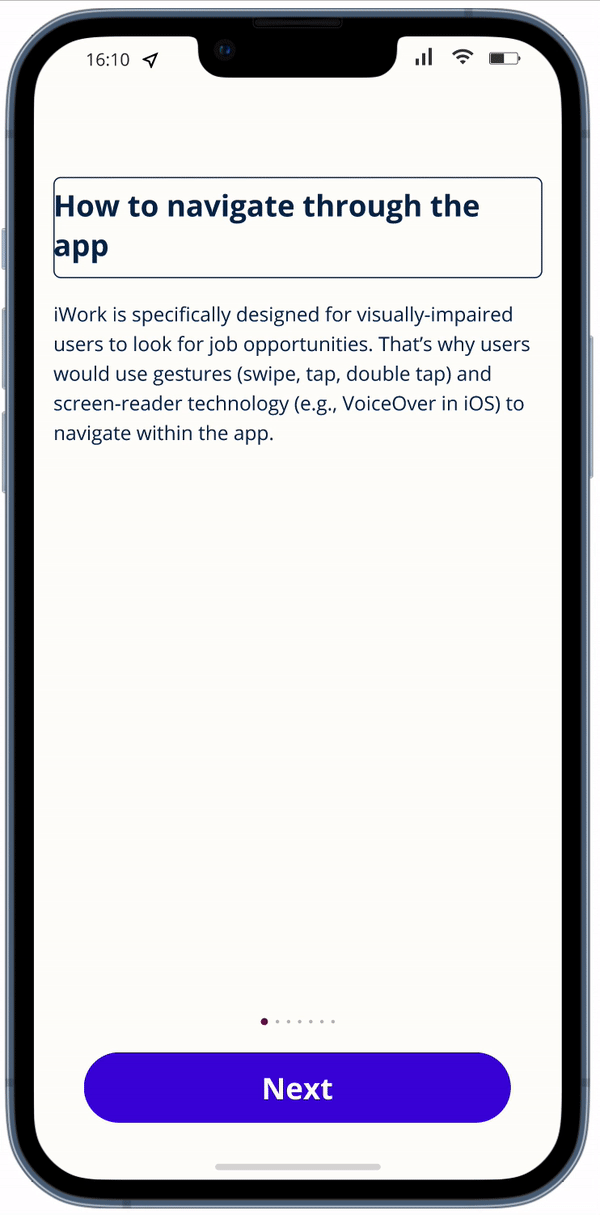
An app and a complimentary website that allow visually-impaired users from an emerging market, specifically Vietnam, to find jobs. This app is designed based on how users use screen-reader technology to navigate through the entire app.
The Problem
In the society, especially in developing countries like Vietnam, visually-impaired people are being greatly excluded from normal activities like working, travelling or simply being independent. There is no accessible and independent way for blind people to find a job on their own.
The Goal
To design an app specifically for visually-impaired users, which means that the navigation and interaction of the app should revolve around how screen-reader applications work.
Project duration
February 2022 - March 2022
My role
UX Researcher, UX designer designing a mobile app and a complimentary website for visually-impaired people to find and apply for a job
Responsibilities
Conducting competitive audit, conducting interviews, paper and digital wireframing, low and high-fidelity prototyping, conducting usability studies, accounting for accessibility, and iterating on designs
Design Thinking Process
In the society, especially in developing countries like Vietnam, visually-impaired people are being greatly excluded from normal activities like working, travelling or simply being independent. There is no accessible and independent way for blind people to find a job on their own.

Project Timeline

Research - Summary
I based my secondary research on two research articles, which are “Non-Visual Access to the Digital Library (NoVA)” (Craven, Jenny; Brophy, Peter; CERLIM: The Centre for Research in Library and Information Management, 2003) and “A Comparative Analysis of the Information-Seeking Behavior of Visually Impaired and Sighted Searchers” (Nuzhah Gooda Sahib, Anastasios Tombros, and Tony Stockman; Journal of the American Society for Information Science & Technology, 2012), about how the visually impaired interacted with search engines.
As far as I’m concerned, many organizations and design firms have required their design teams to conduct user research on a regular basis. This practice is undoubtedly positive, but we can’t deny the fact that many of those doing user research have no formal research background, including me. Some research teams might even cut corners in their primary research, which can harm or cause unnecessary distress to participants. I consider accessibility and research ethics as my main priority when I am doing preparation tasks for this job search app for visually-impaired users.
For this subject matter, because:
-
This is research with a vulnerable group of people.
-
I did not receive special training on how to research sensitive topics or run studies with vulnerable participants.
-
There have been several highly relevant research conducted by professional academic researchers with diverse groups of visually-impaired users in using search engines and navigating touch-screen interfaces.
I decided that user interviews (primary research) in this stage of my design process are no longer necessary.
The similarity between the NoVA project and my app is the experiment of how visually-impaired users undertake a series of experiments with serial searching and retrieval, and subsequent use of digital content since I’m designing a job-search app specifically for visually-impaired people.
Insights from the aforementioned research papers
The main problem for the visually impaired users was actually locating the results, as they were presented part of the way down the screen and, if using a screen reader, they would have to listen to the top part of the screen read out first. When this happened it was not always obvious whether they had retrieved any results at all. Another problem experienced was that if the search returned a large number of results it was not initially clear to the visually impaired user that only the first ten were displayed, the worry being that they may have to listen to hundred of results being read to them. Although in reality most users rarely went past the first three or four results, it was still off-putting to be faced with a large number of results.
Comparisons of time spent searching during the NoVA usability tests showed that visually impaired people have to spend more time searching for information than sighted people (again this concurs with findings of Coyne and Nielsen, 2001). However, times can vary considerably. The design of a site can considerably reduce the time needed if a number of simple design features are included. These would include a logical and meaningful menu, a search facility and a strict limit on the number of links per page (as well as other accessibility design features such as those recommended by the W3C/WAI).
Competitive Audit
Ultimately, there is no app like this on the market. All job search apps are designed for common users and then those apps support screen-reader app in one way or another. Some are really good with screen reader but the app itself might be too complicated for the need of simply being able to find a job. However, some job search apps are just terrible with their accessibility.


Empathising With Users
Empathy Maps
The main idea of the empathise stage is to understand our users, including their problems, their needs, and their point of view.


Personas
Personas are created by conducting user research and identifying common pain points, which are UX issues that frustrate and block the user from getting what they need from a product.
As I create personas, I look for the most common themes in the data and group the users who personify those themes together.
PERSONA: IDA
Problem statement:
Ida is a blind paralympian with a Master’s degree in Technical translation who needs the job application process, particularly for graduate roles, to be more inclusive towards blind candidates like them because the process is currently unfair and not inclusive, which results in a high unemployment rate among visually-impaired people

PERSONA: ROSHAN
Problem statement:
Roshan is a 40-year-old masseur with low vision and not so tech-savvy who needs to find information online, especially in job posting sites, more easily without having to memorise too many things because they want to find information about jobs online without having to ask for assistance from friends or family

User Journey Map
A user journey is the series of experiences a user has as they achieve a specific goal. The approach to creating a user journey map depends on what stage of the design process the designers are in.
Since I'm just starting the design process for creating a product, my journey map should track the user’s general experience of what they go through to achieve their goals.
PERSONA: IDA
GOAL: Search and apply for jobs

Ideation
Paper Wireframes
I did several Crazy-8 sessions to ideate the main screens of the app. Starting with a list of items included in a screen, i began to sketch a few versions of each screen. Then i picked out the features i like most in each screen and later combined them in the final screens.
I focused on the search flow and resume creator.


What troubled me the most was how to solve the problems in terms of usability I'd found in the secondary research.
1. Spelling errors wouldn't be a big issue for sighted users as there are many automatic spell checked available in search engines. However, for users with visual impairment, more often than not they do not use the spelling suggestions for 2 reasons:
-
They skipped the part where the screen reader would read the word out loud.
-
Even if they tried to listen all the way through, they wouldn't be able to make use of the spelling suggestions due to the analogy in the pronunciation between the word with incorrect spelling and that with correct spelling (e.g., "tutor" and "tuter" have the same pronunciation)

Solution to Spelling error problem
2. The number of links per page: The number of links per page should be such that a user who has to listen to them being read out will be able to retain all in memory.
 Solution 1 to The number of links per page: The result page shows 15 results, divided into 3 pages. |  Solution 2 to The number of links per page |
|---|---|
 Solution 3 to The number of links per page: Result page shows Previous and next button at the top of the page. |
Solution to The number of links per page
3. Interface of the search function: Search box should be put in the most prominent place a prominent place (such as near the top of the page). Visually impaired users also preferred to be provided with a search box rather than a link to a separate search page, as this was just one more step for them to take. However, from the secondary research, once located it was not always obvious to some of the visually impaired users where they had to enter search terms, or how to activate the search. This was a particular problem when using a screen-reader and some users thought they had entered terms and activated the search, but in fact had not. This confusion continued when no results were returned, as it was unclear to the user whether there were no resources available or whether they had not properly activated the search. Therefore, it is important for me to show clear visual and aural clues once the search is activated.

Solution to The interface of the search function
Wireframes
Digital Wireframes
During my research process, i found out that the 2 biggest problems that prevent people with visual impairment to work are:
-
Location
-
Inaccessibility in workplace/hiring process
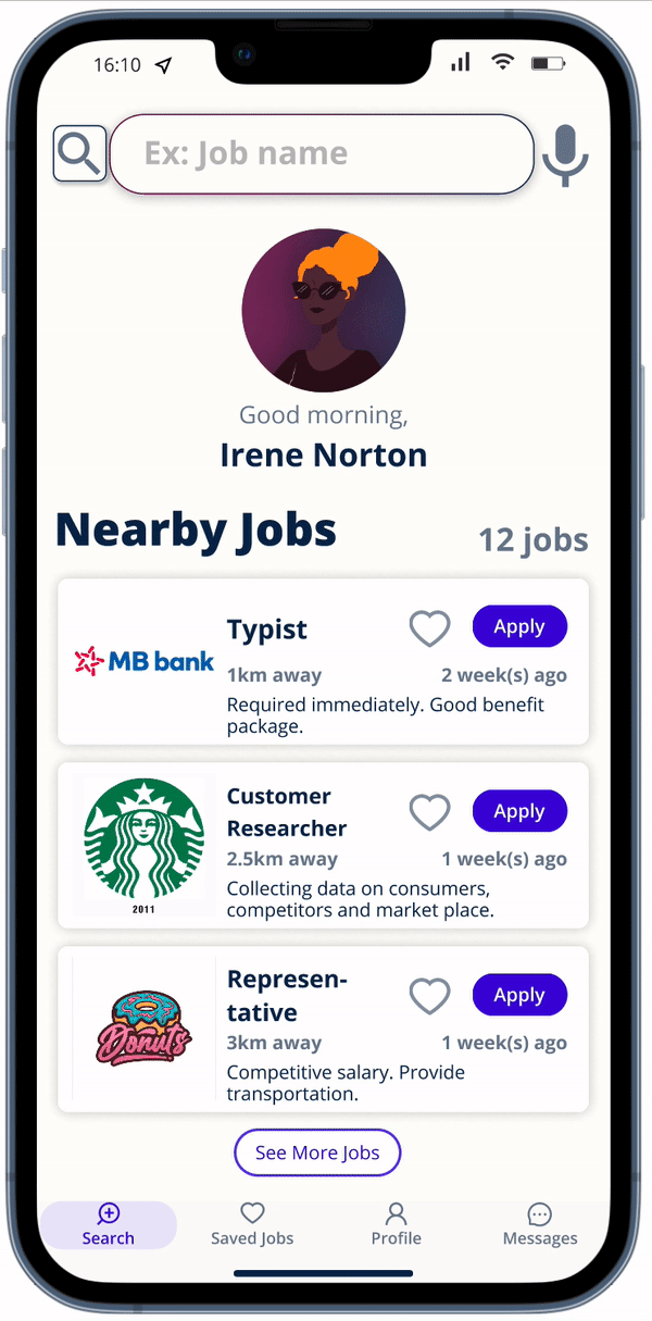
As a result, i prioritise location for the home screen as this group of users is unable to drive for most of the time. They have to rely on public transport or walking. I also added messaging function so that employees can address any concerns they have for the recruiters.

Being unable to complete the search process due to spelling errors is a common challenge among visually-impaired users.
The problem is when the error is spotted, users can’t “hear” the difference between the correct and wrong spelling. For example, “tuter” and “tutor” have the same pronunciation. To solve this problem, the app provide a guide for spelling errors with an alert as “Spelling mistake spotted. Did you mean [the correct spelling. Spelled out]?”

The app is navigated page by page, instead of scrolling. This decision was made because many visually-impaired users find it frustrated having to scroll down without knowing how many pages there are left.

Low-fidelity Prototype
Since my lo-fi prototype is quite complex, i have made a user flow diagram with the wireframes instead. The main flow here are searching and creating a resume.

Below is a video of the main flow of the app. This app is designed with the screen-reader-oriented approach.
Wireframes
Usability Study: Parameters
Study type
Moderated usability study
Participants
4 participants
Location
Vietnam, remote
Length
30-40 minutes
Usability Study: Findings
From the usability study i conducted with 4 users, there are 4 issues that should be my prioritised 0.
Onboarding
Some users find it challenged to navigate through as they are not familiar with screen-reader nor technology.
Email notification
Most users want to receive a confirmation email after they successfully apply for a job.
Save jobs
Some users want to be able to save potential jobs for later view.
Date posted
Most users want to see date posted of a job listing in the preview section without having to click on it.

Prioritised Insights by using Prioritisation Matrix Diagram
Refining The Design
Visual Design
Even though this app is specifically designed for visually-impaired people, that doesn't mean I overlooked the visual design. An inclusive colour scheme can accommodate people who have low or partial vision. Furthermore, UI elements need to be clear, straightforward and large enough to create a smooth experience.
Logo Design

Braille is the language that most people with visual assistance use to access information. I took inspiration from this language to make the logo lean towards this community more.
The name of the app is "EyeWork", in Braille it would be:
⠑⠽⠑⠺⠕⠗⠅
Final logo:

Sticker Sheet


Mockups: Design Choice Walkthrough
Based on the insights from the usability study, I have made some changes to the user flow and UI features.
1. There was no onboarding flow before. After the usability study, an onboarding flow with visual and non-visual guidance to help users get used to with the basic of how screen reader is used in mobile apps.
Before Usability Study

After Usability Study
In order to support low-vision users, the search bar is made to be clearer with the floated text box. Job listing preview shows date posted and other important info for visually-impaired users. Bottom navigation bar is added with profile tab so that users can access their profile from anywhere in the app.

Date posted has been added to the mockup right under the Apply button. A link to all jobs from company X is also added in order for users to be able to see other jobs from one company easily. The message button right next to the link allows users to get in touch with HR department in case users have any inquiries.

Message section is for users to contact directly the company to ask any further questions the jobs or the hiring process, in case users don’t have or don’t know how to use emails.

Mockups: Main screens


High-fidelity prototype
My hi-fi prototype flow consists of around 200 frames. Therefore, i simplified them in order for stakeholders to have a big picture for the main flow of the app.

Accessibility considerations
Screen-reader Oriented
The app is designed entirely based on how visually impaired people use screen reader technology (e.g., VoiceOver on iOs) in mobile app.
Colour-blind awareness
In order to accommodate low vision users and users with colour disorders (e.g., protanopia, deuteranopia), the color scheme of the app is colour-blind friendly. Buttons and other important information are forefront and direct.


Beyond Alt Text: Screen-reader Script
To ensure visually-impaired users’ smooth experience with the app and screen-reader technology, the app is designed with scripts for important elements like textboxes, images, buttons, and links.


Responsive Design
Sitemap
The target end-users for this job search app is the visually-impaired users among “The Next Billion Users”, which means that smartphone is their main means to approach the Internet. On that account, the complimentary website virtually serves as a way to direct users towards the mobile app and to inform users about the purpose of the app.


The video is a demo for the responsiveness of the website.
Even though the website serves as a pathway to lead users to the mobile app, it is responsive and can work well with screen-reader technology, or with users who use keyboard to navigate.
Going Forward
Takeaways
01
Impact:
Even though the app still contains many errors and inaccessibilities to visually-impaired users, this app has been disability-oriented, not just an able-users-oriented app with a layer of accessibility. One participant from the usability test has input that most apps in Vietnam are completely inaccessible to people who need visual assistance; this app would make a great difference if it were made.
02
What I learned:
New products come with new challenges that are completely out of my comfort zone. Challenges that require me to learn about new types of users and products are the ones teach me the most about problems that need to be solved. I’ve learned how to deal with novel problems, to empathise with a group of users that i had never considered their existence enough.
Next Steps
01
Continue to conduct more usability study on how well the app works with screen-reader technology and how the scripting for screen reader works in programming.
02
Refine the script for screen reader.
03
Refine the script for screen reader.
Thank you for your time reviewing my work on the EyeWork app! If you’d like to see more or would like to get in touch, my contact information is provided below.


